DAIJYA ROBINSON
Game Design and Development For The Future
Echo Breach
Click To Play!
You and a friend wake up from cryosleep to find your spaceship, a place once viewed as your home, has turned into a nightmare. Time is running out to repair your compromised and failing spaceship before it crashes into the Earth below. There’s not a moment to spare, how will you survive?
The Game's Development
I. Core Problem & Initial Thinking
Echo Breach was created by a team of 5 in the span of 15 weeks. The core problem our team wanted to solve was: How do you create a cooperative horror game where both players feel equally important? We established three design pillars: Urgency (limited time to complete tasks), Coldness (isolation on a broken ship), and Relevance (each player's strengths must matter). We drew inspiration from Alien Isolation for atmosphere, Dead Space for visual design, and It Takes Two for cooperative puzzle mechanics.
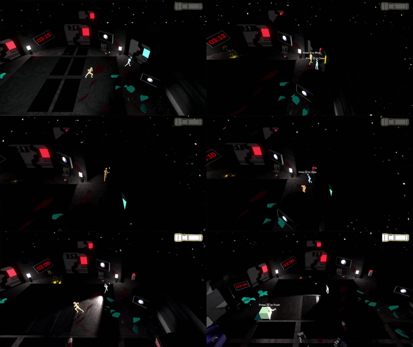
Echo Breach Gameplay

Our three design pillars guided every decision. 'Relevance' was personal to me – I wanted both players to feel essential, which influenced my UI design to clearly communicate each character's unique abilities.
II. My Contributions
-
UI/UX System: The menu, button, HUD element, and navigation screen was built from scratch in Unity using C#.
-
Character Selection Screen: Helped programmers coded the logic that detects which player picks which character and stores that choice for the whole game.
-
On-Screen Timer & Diegetic UI: I programmed the timer that counts down to doom and figured out how to display it on in-game monitors.
-
UI State Machine: I designed the flowchart that governs how the game moves from splash screen to menu to character select to gameplay and back.
-
Cross-Team Communication: I acted as the bridge between our programmers and artists, making sure UI assets got implemented correctly and on time.
III. Tools & Technologies
-
Game Engine: Unity 2022.3.46f1
I chose Unity because I already knew it. That sounds simple, but it was a practical decision: I didn't want to learn a new engine AND build a complex UI system at the same time. Familiarity meant I could move fast. -
Code Editor: Visual Studio
Standard for Unity C# development. Nothing fancy, but it works. -
Version Control: GitHub
This was non-negotiable for me. In past group projects, we lost work because two people edited the same file. I insisted on pull requests: every change to my UI code had to be reviewed by another programmer before merging. It slowed us down a little but saved us from catastrophic conflicts. -
Project Management: Trello, Discord, Miro
-
Trello: I tracked every UI task here. Each button, each screen, each bug had a card with a due date.
-
Discord: Daily check-ins. I'd post "I'm working on the character select screen, should be done by EOD."
-
Miro: We used the Starfish technique for retrospectives. I personally found it helpful to see "Start/Stop/Keep/More of/Less of" laid out visually.
-
-
Art Tools: Unity Editor, custom shaders
The artists made the 2D UI mockups in Photoshop. I then took those assets and implemented them in Unity, often having to slice sprite sheets and set up nine-slicing for scalable buttons. -
Documentation: Google Docs, Google Drive
I kept a personal "UI dev log" in a Google Doc. Every time I solved a bug or learned something, I wrote it down. This became my reference when similar issues popped up later.
IV: Mechanics
Core Mechanics
When I sat down to build the UI for Echo Breach, I asked myself: What does the player need to know, and when?
-
For the "brains" player (the one with the flashlight), they needed to see battery level. That's it. So I made a simple battery icon that drains visually. No numbers, no percentages—just a visual bar. My thinking: in a tense horror game, you don't want players reading statistics. You want them feeling the urgency.
-
For the "brawn" player, they didn't have a battery, so their UI is almost empty. That was intentional. I wanted the "brawn" player looking at the world, not at the screen edges.
The hardest UI decision was the timer. We originally had a big digital clock in the corner. But during early playtests, players ignored it. So I thought: What if the timer was part of the world? I proposed putting countdown screens on actual monitors inside the spaceship. Players couldn't ignore it because it was literally in front of their character. I spent a weekend figuring out render textures and Unity materials to make this work, but it was worth it—playtesters started panicking when they saw the planet getting closer on the screens.
Echo Breach Gameplay
Control Systems
I didn't just code the controls; I had to design how players learned them. My thinking went like this:
-
Step 1: Player picks a character. The selection screen should tell them what that character does.
-
Step 2: Game starts. The intro cutscene should highlight points of interest (doors, puzzles, the exit).
-
Step 3: During gameplay, the UI should be minimal. Only show information when it's relevant.
I built a simple state machine on paper first. I drew boxes for "Main Menu," "Character Select," "Gameplay," "Game Over," and "Pause." Then I drew arrows for transitions. This flowchart became my blueprint. When I coded, I just translated those boxes into C# enums and switch statements.
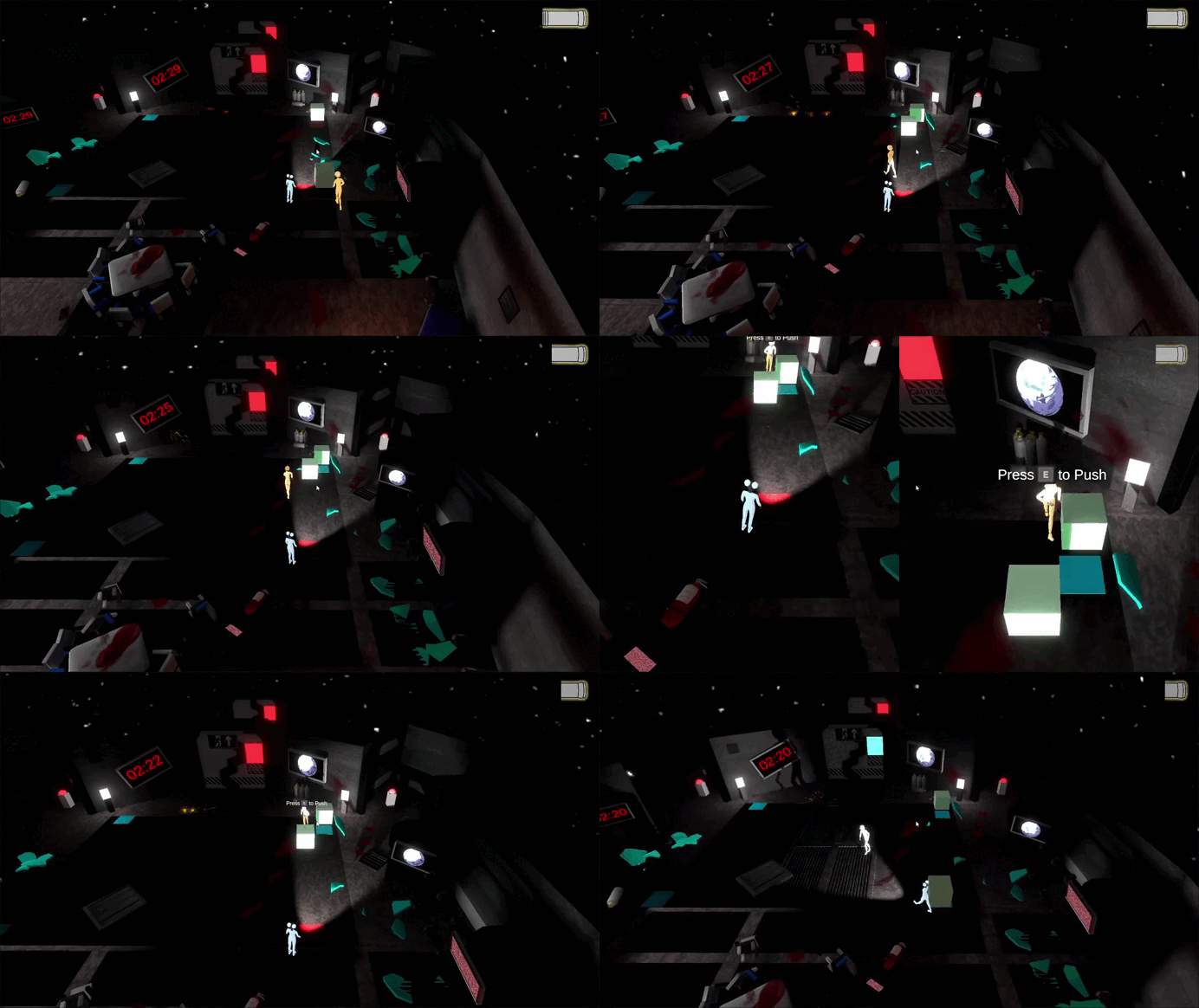
The Timer Problem
The original timer was a simple TextMeshPro element in the corner. But players didn't notice it during intense moments. So I asked: How do I make the timer un-ignorable?
-
Idea 1: Make it bigger and red. No, that's ugly and breaks immersion.
-
Idea 2: Add a ticking sound. Good, but audio alone isn't enough.
-
Idea 3: Put the timer on screens inside the game world. Yes! But how?
I didn't know how to do Idea 3. So I researched. I found a tutorial on render textures. I learned that you can point a second camera at a UI Canvas, then display that camera's output on a 3D object's material. I spent two days prototyping this in a blank project before integrating it into Echo Breach.
The result? A timer that exists in the world. Players see the countdown on wall monitors, on the main terminal, even on their wrist devices (if we had time to implement that). It's diegetic. It's immersive. And it works because I was willing to fail forward and learn something new.
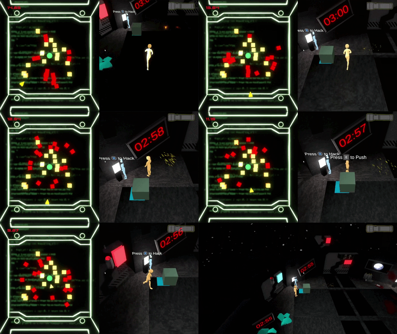
Echo Breach Gameplay
Onboarding
The character selection screen was my baby. I knew from playtesting that players were confused about what each character could do. So I added information panels that appear when you hover over a character. But then I thought: What if two players are using controllers? Hover doesn't work.
So I redesigned. Now, when a player selects a character, the information panel pops up automatically. I also added visual icons: a flashlight icon for the "brains" player, a fist icon for the "brawn" player. No text needed. My rule was: if a child can understand it at a glance, it's good UI.
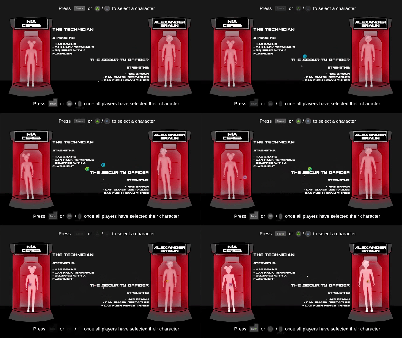
Character Select Page
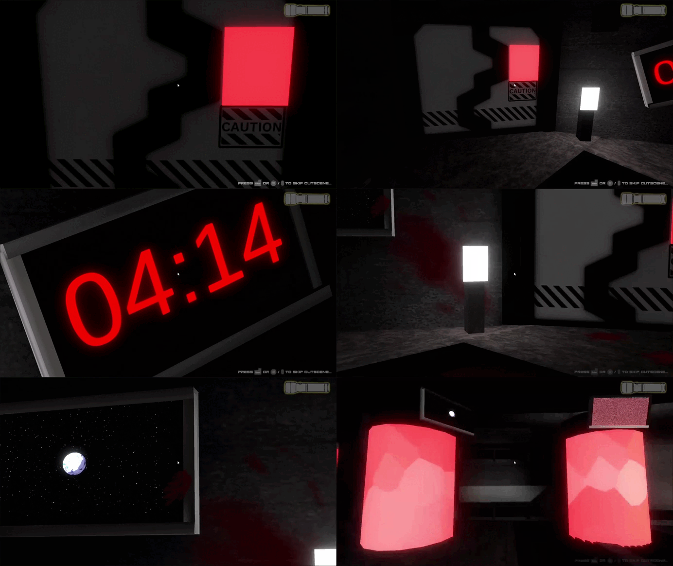
Intro Cutscene
V: Design
Echo Breach centers on immersing players in a sci-fi horror experience, combining visual, auditory, and interactive elements to evoke tension and fear. The game focuses on sci-fi horror through a decaying spaceship setting, featuring dim lighting, claustrophobic corridors, rusted panels, and flickering lights inspired by Dead Space. Realistic idle animations, like nervous fidgeting or scanning, enhance immersion, while layered ambient sounds and silence amplify tension and isolation. A minimalist, dark UI ensures seamless integration, letting the environment and atmosphere drive a chilling and cohesive horror experience. I helped develop and implemente this UI/UX system in Unity, utilizing C# for coding and functionality.
UI Mockup Evolution
The images on the top are the original prototype of the game's UI and the ones on the bottom are the final version that was put into the game. I learned the hard way that UI is not an afterthought. I had to:
-
Tighten hitboxes: I wrote a debug mode that drew collider bounds in red. If two red boxes overlapped, I knew I had a problem.
-
Add button states: Normal (gray), hover (white), clicked (dimmed), disabled (dark gray). This took me a full day to implement because Unity's UI system doesn't do this automatically for non-Button components.
-
Simplify, simplify, simplify: The original HUD had a minimap, a health bar, an inventory slot, a timer, battery level, and objective text. I cut it down to just timer + battery (for the "brains" player). Everything else was distracting.
Protoype


Final Version


UI State Diagram
The diagram shows:
-
Main Menu → Character Select → Gameplay → Game Over (or back to Main Menu)
-
From Gameplay, you can go to Pause → back to Gameplay or Main Menu.
This diagram saved me from state conflicts. Without it, I would have had bugs like "the game thinks you're still on the main menu while you're playing." With it, I just coded exactly what the arrows said.
VI: What I Learned & Post-Mortem
My Biggest Failure
I underestimated how long UI polish takes. I thought "the UI is done" after Week 8. Then we did a playtest, and players couldn't figure out how to start the game because the "Start" button's hitbox was offset. I spent Week 9 just fixing hitboxes and button states. I should have allocated two full weeks for polish from the start.
My Biggest Win
The diegetic timer. When I saw playtesters actually looking at the in-game monitors and saying "Oh crap, we only have two minutes left," I knew I had done something right. It wasn't a complex system—just a render texture and a second camera—but it completely changed how players experienced the game.
What I Learned
-
To draw things first. Flowcharts on paper save me hours of confused coding.
-
Prototype risky systems in isolation. The render texture timer took me two days in a blank project before I touched the main game.
-
Ask for help earlier. I spent three days trying to fix a shader issue before admitting I didn't understand Unity's material property blocks. A teammate solved it in 20 minutes.
-
Documentation isn't optional. I kept a personal dev log. Every bug, every solution, every "aha!" moment went into a Google Doc. By Week 14, that doc saved me from repeating my own mistakes.
If I Did It Again
I'd build the UI state machine on Day 1, not Week 4. I'd create a UI style guide (colors, fonts, button sizes) before writing any code. And I'd schedule a "UI polish week" with no new features allowed—just fixing hitboxes, adjusting layouts, and making everything feel responsive.
Echo Breach taught me that UI is not "just buttons." UI is the player's entire conversation with the game. If that conversation is confusing or frustrating, nothing else matters. I'm proud of what I built, but I'm even prouder of what I learned about showing my work, admitting my mistakes, and fixing them one step at a time.
Credit Page