DAIJYA ROBINSON
Game Design and Development For The Future
The Noble Adventure
Click To Play!
With your queen missing and an evil wizard at fault, it is up to you to restore order. Are you up for the task? The Noble Adventure is a 2D fantasy puzzle RPG where the player is tasked with finding their beloved Queen after a wizard kidnaps her. Travel to various villages to gather leads, identify accessibility barriers, and use inclusive tools to communicate with the villagers.
The Game's Development
I. Core Problem & Initial Thinking
The Noble Adventure started as my capstone project, which then became a personal passion project. When I first sat down to plan this game, I had one central question: How do I make players feel an accessibility barrier, not just read about it?
I knew I didn't want to make a game where accessibility was a checklist of settings in a menu. I wanted it to be the core mechanic. The player shouldn't just learn about dyslexia; they should experience a version of it.
My initial thinking was scattered. I had big ideas: three complex puzzles, fully custom art, an open world. But I was a solo developer who worked as a programmer, designer, writer, and pseudo-artist all at once. I quickly realized I couldn't do everything. So I asked myself: What's the absolute minimum needed to make a player feel frustration, then clarity, then empathy?
That question became my scope filter. Every feature had to serve that emotional arc. If it didn't, I cut it. This was hard. I wanted to add more, but I'd learned from past projects that scope creep kills solo developers.

The Noble Adventure Gameplay
II. My Contributions
-
Everything. I was a team of one. That meant programming, design, writing, animation, UI/UX, research, playtesting, and project management.
-
Dialog System: I built the interactive textbox system that visually distorts words (jumbled letters, shaking text, letters "flying off" the page) to simulate dyslexia.
-
Puzzle Mechanics: Designed and coded all puzzles, including the final combination puzzle that merged two dyslexia features.
-
Accessibility Features: Implemented adjustable text size, a clear font (Nihonium), and no button-mashing requirements.
-
Research & Validation: Worked directly with RIT's Disability Services Office (DSO) to ensure accurate representation.
-
Player Feedback Systems: Built the Movelist screen, pause menu, and Settings menu for text size and controls.
III. Tools & Technologies
-
Everything. I was a team of one. That meant programming, design, writing, animation, UI/UX, research, playtesting, and project management.
-
Dialog System: I built the interactive textbox system that visually distorts words (jumbled letters, shaking text, letters "flying off" the page) to simulate dyslexia.
-
Puzzle Mechanics: Designed and coded all puzzles, including the final combination puzzle that merged two dyslexia features.
-
Accessibility Features: Implemented adjustable text size, a clear font (Nihonium), and no button-mashing requirements.
-
Research & Validation: Worked directly with RIT's Disability Services Office (DSO) to ensure accurate representation.
-
Player Feedback Systems: Built the Movelist screen, pause menu, and Settings menu for text size and controls.
IV: Mechanics
Core Mechanics
I built the game around three core mechanics, each tied directly to my design pillars (Enlightened, Inspired, Empathetic).

Interactive Dialog
I knew that to build empathy, I first had to create frustration. So I designed the dialog system to fight back against the player. I researched how people with dyslexia describe their reading experience. Common phrases: "jumbled," "letters flying off the page," "like reading a different language." I translated that directly into code.
The text in NPC dialog boxes:
-
Randomly swaps adjacent letters
-
Shakes or vibrates
-
Occasionally has words that visually "drift" upward
I coded this by creating a coroutine that manipulates a TextMeshProUGUI component every frame. The challenge was doing this without breaking the underlying string data. I solved it by keeping the original text in a separate variable and only modifying the displayed text. This way, the game logic still saw clean text, but the player saw the distortion.

The Noble Adventure Gameplay
Fetch Quests
After the player experiences frustration, they're given a fetch quest. This wasn't just "go get item X." It was a test. I borrowed the structure from Stardew Valley's "Marnie's shorts" quest: simple, clear, low-stakes. But the purpose was different. The fetch quest asks the player: Now that you've felt frustration, will you help someone else who feels this every day?
The challenge was making this clear. In early playtests, players asked, "Why am I doing this?" They didn't connect the quest to the accessibility metaphor. So I added NPC dialogue that explicitly linked the two: "Ever since the wizard's curse, my words get all jumbled. Could you find my [item]? It's hard to read the labels." That small change made the metaphor click for players.

The Noble Adventure Gameplay
Puzzles
I originally planned three interactive puzzles. I only shipped two interactive + one visual.
-
Puzzle 1 (Flying Words): I simulated letters drifting off the page. The player had to "catch" the correct letters in order. This represented reading fatigue, how a dyslexic person might lose their place or see words move.
-
Puzzle 2 (Jumbled Grammar): The entire sentence was scrambled. The player had to rearrange words into the correct order. This represented the experience of seeing text as "a different language."
-
Puzzle 3 (Cut): I originally had an "Eye Spy" visual puzzle. But after consulting with the DSO, I realized it didn't represent dyslexia at all. Players compared it to a standard hidden-object game. I cut it entirely, even though I'd spent two weeks on art and code. That hurt. But keeping it would have undermined the entire message.
-
The Combination Puzzle: Late in development, I created a third puzzle that combined both flying words and jumbled grammar. It wasn't fully interactive (players couldn't manipulate the text directly), but it served as a capstone experience showing how multiple dyslexia features can occur simultaneously.
Protoype


Final Version
Final Flying Word Puzzle
Final Grammar Puzzle


Final Combination Puzzle
.png)
Control Page
Control
Originally, I wanted point-and-click movement. It felt more like a traditional adventure game. But early playtesting revealed a nightmare: bugs everywhere. Click detection was inconsistent. Pathfinding broke. Players got stuck on geometry.
I made a hard call: switch to WASD movement. This meant rebuilding the player controller from scratch. It took three days. But after the switch, exploration became smooth and predictable.
My thinking: A game about empathy shouldn't be frustrating because of bad controls. The only frustration should come from the intentional dyslexia simulation.
Onboarding
I didn't want a pop-up tutorial. Those break immersion. Instead, I built onboarding into the game's structure:
-
The Movelist Screen: Available from the main menu. Players can read controls before starting.
-
The Moves Menu: Accessible during gameplay via the pause menu. Players can remind themselves of controls without leaving the game.
-
Accessibility Settings: Text size slider (adjustable anytime) and font choice. After playtesting, I switched the default font from Yoster to Nihonium because Yoster was still hard to parse for players with and without dyslexia.

Objective Page
The Puzzle That Almost Broke Me
The "Flying Words" puzzle was my biggest technical hurdle. I wanted letters to literally drift upward off the text line, then snap back. But Unity's TextMeshPro doesn't support per-character animation easily.
I spent two days researching solutions. I found a forum post about using a custom vertex shader. I don't know shaders well. But I learned enough to modify an existing shader to offset character positions over time.
The result was messy. The animation was jittery, and performance dropped with long text strings. So I pivoted. Instead of per-letter drifting, I made the entire word jitter and occasionally "pop" upward. It wasn't perfect, but it worked. And playtesters got it. They said, "This is frustrating. I keep losing my place." That was exactly the response I wanted.
V: Design
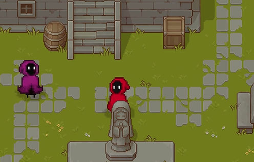
The Noble Adventure offers a gameplay experience reminiscent of storybook fantasy games, characterized by its whimsical art and muted color palette. Due to being a solo developer, I used free assets to create a functional village environment, selecting an asset pack that fits the magical theme with soft colors, fantasy architecture, and a storybook atmosphere. I animated all characters using Unity's animation tool, adjusting their color palettes in Photoshop before importing. The player will see the Knight in a bright red hooded cloak, while NPCs use muted colors to allow the main character to stand out more brightly on screen, helping players quickly locate their character without intrusive UI markers.
UI Mockup Evolution
My first UI was ugly. Placeholder buttons, overlapping hitboxes, a confusing Settings menu. I'm a programmer, not a UI artist. So I kept it simple.
-
Main Menu: I used free assets, but I arranged them to be clean and readable. The color scheme (warm tones for the main character, muted for backgrounds) guides the eye without clutter.
-
Game Scene UI: I placed the objective text in the top-left (where players naturally look) and kept it minimal. No minimap, no health bar, no inventory grid. The only persistent UI is the objective reminder.
-
Pause Menu: I built this late in week 12. It was a risk, because pausing in a puzzle game can break immersion. But playtesters requested it, so I added a simple pause that freezes all coroutines (including text distortion).


UI State Diagram
I create the state diagram in google docs. It showed:
-
Main Menu
-
Main Menu → Start Game, Credits, Quit
-
Start Game → Movelist → Prologue → Gameplay
-
Gameplay → Pause
-
Pause → Settings, Controls, Main Menu
-
Controls → Movelist
-
This diagram prevented state bugs. Without it, I would have had issues like "the pause menu thinks the game is still in prologue.

VI: What I Learned & Post-Mortem
My Biggest Failure
I underestimated the cost of learning new skills. I had to learn level design, character design, storytelling, and animation while building the game. I planned as if I already knew these skills. I didn't. The result: scope cuts. Three interactive puzzles became two interactive + one visual. Open quest completion became linear. Full animations became idle + walk only.
My Biggest Win
The DSO consultation. When a committee member said, "working directly with disability services is exactly the right way to handle sensitive representation," I knew I'd made the right call. The research took time, but it saved me from releasing a game that was accidentally offensive or inaccurate.
What I Learned About Solo Development
-
Hard coding is a trap. I hard-coded everything: dialog, puzzle configs, quest objectives. It felt faster at first. But by week 10, changing a single line of dialog meant hunting through three scripts. Adding the third puzzle became nearly impossible. Next time, I build data-driven systems from the start.
-
"Almost done" is not a real status. I kept treating features as "almost done" for weeks before admitting they needed to be cut. The third puzzle never made it as interactive. I should have cut it in week 8, not week 13.
-
Solo does not mean isolated. I had no peer feedback loop. I spent three days polishing the fetch quest thinking it was perfect, only to discover in playtesting that players didn't understand how it connected to the core metaphor. Next time, I conduct playtests no matter the game's state.
-
Fear is a signal. When I became afraid to touch working code, that was a sign of technical debt. I ignored it and kept adding features. That made it worse. Next time, when I feel that fear, I stop and refactor immediately.
If I Did It Again
I would spend the first two weeks building a generic, data-driven system for dialog, puzzles, and quests. All content would live in external files (JSON or ScriptableObjects). Then I could tweak text and puzzle parameters without touching code. I would also schedule a "refactor pass" as a mandatory milestone at the end of each month. No new features that week, only cleaning and documenting. And I would cut features ruthlessly. The question "If this doesn't ship, does the game still work?" should have been asked in week 3, not week 7.
The Research
Beyond the game itself, I wrote a research paper titled "Leadership Advocacy For Accessibility Within Gaming." It explores how developers can advocate for accessibility through UI/UX design and programming. The paper examines evidence-based strategies to break down the misconception that accessibility is "too costly" or "too niche."
This research directly informed the game. Every design decision, from the font choice to the no-button-mashing rule, came from reading academic and industry guidelines on accessibility
I consulted with the Disability Services Office (DSO) at RIT to accurately represent dyslexia. Research showed that dyslexic players can experience text as "jumbled," "letters flying off the page," or "reading a different language," so I translated this into interactive textboxes that visually distort during NPC dialogue.
Font readability became a major adjustment after testing with players with and without dyslexia. I moved from Yoster to Nihonium after feedback showed that the original font was still difficult to parse. Additionally, testers helped me recognize that one puzzle did not accurately represent dyslexia; players compared it to a standard hidden-object game rather than the experience of jumbled or scrambled text. I cut that puzzle entirely to prevent distraction from the other dyslexia-focused mini-games.
Beyond the game itself, I authored a research paper titled "Leadership Advocacy For Accessibility Within Gaming," which explores leadership tactics for embedding accessibility in game development through UI/UX design and programming. The paper examines how developers can provide evidence-based advocacy to break down misconceptions that accessibility is too costly or niche.
Playtesting and research reinforced that every mechanic must serve the game's goal of representing accessibility barriers. The switch to WASD, the font change, the puzzle cuts, and the DSO consultation were all direct results of this iterative, research-driven process.

The Noble Adventure Gameplay
Final Reflection
The Noble Adventure taught me that the hardest part of solo development isn't the coding. It's the discipline of knowing what not to build. It's the courage to cut a puzzle you spent two weeks on. It's the humility to ask for help (from the DSO, from playtesters) before you've "finished." I'm proud of what I shipped. Players felt genuine frustration, and that frustration led to understanding. One player said, "I've never thought about how difficult reading could be for someone with dyslexia." That one sentence made every hard cut, every late night, and every moment of self-doubt worth it.
Title Page

The Noble Adventure Gameplay
_edited.jpg)
.png)
Credit Page